Shoppers Medical Cannabis
A lesson in decoupling dependencies and applying lean methodologies.
Background
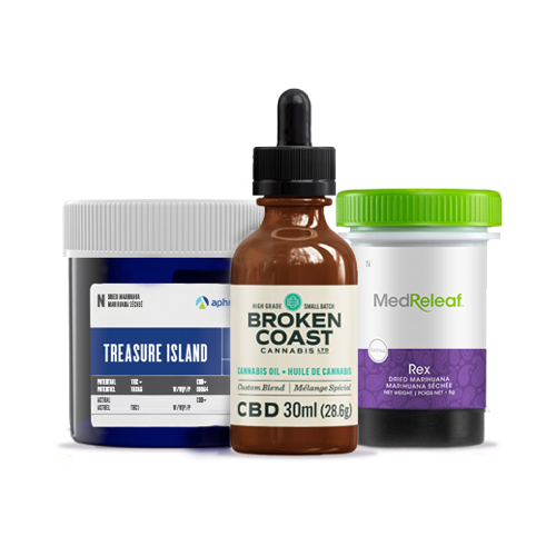
Shoppers Drugmart (Shoppers) was going to be the first of it’s kind by being a Medical Cannabis marketplace. Currently when a patient has a prescription they are only allowed to buy a medical cannabis from the Licensed producer. This means that if the Licensed producer is out of the strain you use, then I can be a long while before it’s back in-stock. By being a marketplace this would allow patients to have prescription to Shoppers thus allowing to buy from different Licensed producers that Shoppers carries.
My role
Led the design of digital experience, creating a seamless omni-channel user experience journey for purchasing and learning about Medical Cannabis.
At the inception of the project, we didn’t have a product owner, or project manager. I stepped into that role and setup a framework for team to be able to deliver.
The problem
How might we sell medical cannabis online? That’s a great question! Medical Cannabis is a new heavily regulated online space that posed a great challenge. Working with SDM, we looked for a way that we could no only sell Medical Cannabis online but also educate new patients and doctors on cannabis.
Note: When I say WE I mean myself (Stefan - Senior product designer) and Adam Brance (product designer) and Jenny Diep who I had the pleasure working with on this project.
Customer insights & ideation
Being a space still with a stigma, patients used cannabis as a natural ways to treat their aliments with less side effects that traditional pharmaceuticals have.
The other component of the site is to educate new patients and doctors about the benefits of using medical cannabis.
Strategy & vision
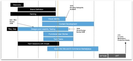
The first iteration of site needed to be delivered to our developer partners in under 6 weeks. Meaning within 6 weeks it needs to be tested and validated. In reality means the core parts of the site needed to complete in under 4 weeks.
Planning & scope definition
Working with an external agency, I made the call to decouple the dependency from them (because delivery of branding, colours and content would be 8 weeks out) and move forward with designing our pages by analyzing our other sites (Loblaws, Joe Fresh and Beauty Boutique) pages and use the higher converting pages as baselines for our designs.
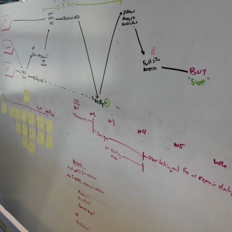
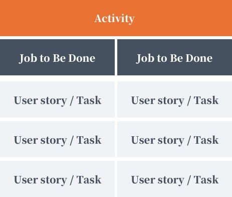
Adopting a technique of story mapping from Agile product planning this helps capture requirements for each section of the site and help distribute the work between myself and another designer through a simple Kanban board.
Oversight & Coordination
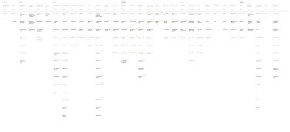
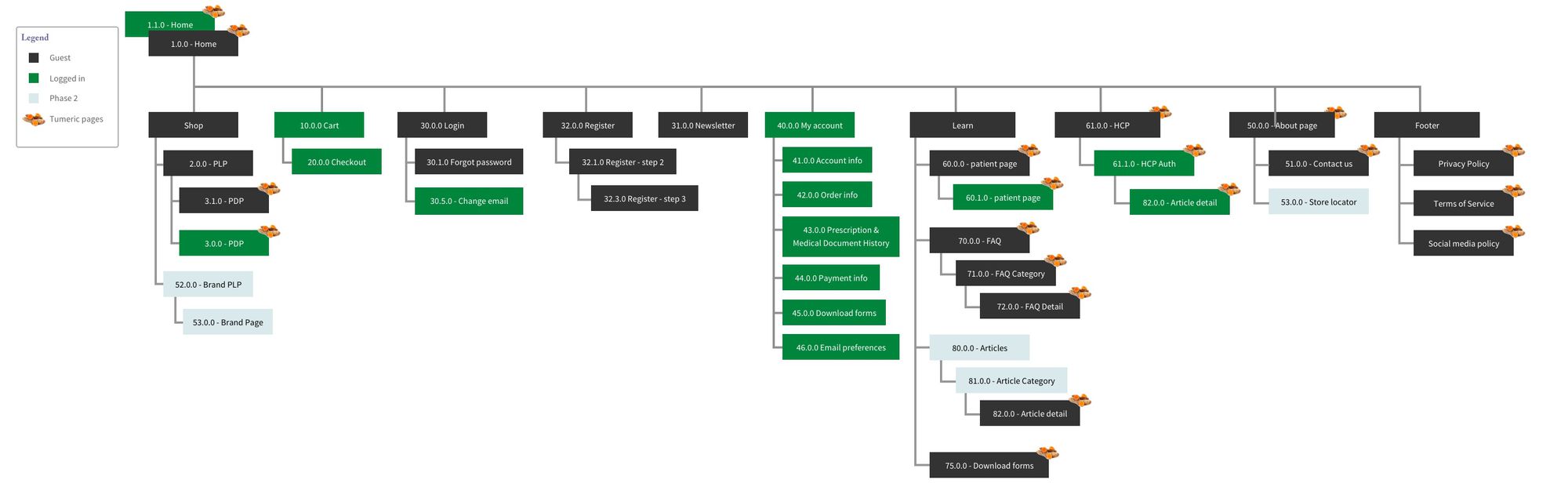
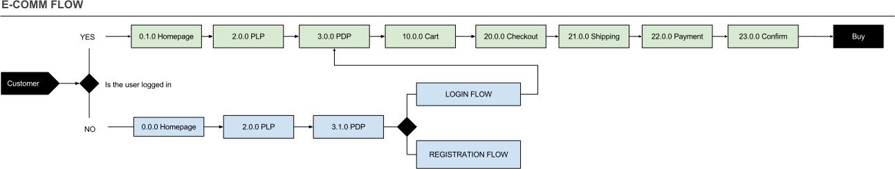
Working with our stakeholders we mapped out the ideal user task flows, broke down the site map and began crafting the information architecture.
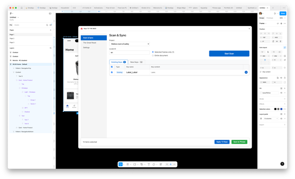
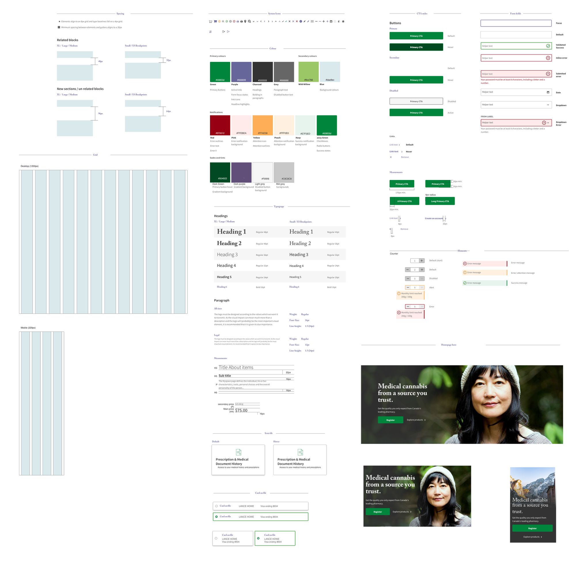
In parallel we laid the ground work for creating a design system, working in with a lean methodology we could apply visual styling when the branding was ready. Allowing the developers to create the interactions and data points. Read more about it here
KPIS
It’s difficult to bench mark what good would look liek being a new online space. We set three main KPI, increase customer knowledge, reach the baseline conversion of the other sites. Also gain marketshare in the growing medical marijuana industry.
The Focus
The main objective of this project was to increase marketshare and gain new patients for prescriptions, by helping customers understand how to get a prescription. The primary focus was to sell cannabis, but making sure to educate the users when it made sense.
Eexcution & Validation
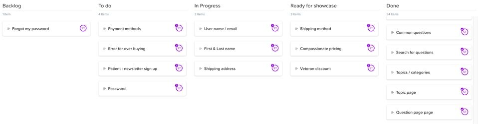
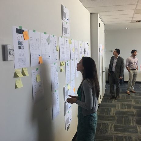
Between crafting the IA and the story map, we broke the section into 1 week sprints. The site was designed in a mobile first and accessible approach. At the end of each sprint both desktop and mobile wireframes were printed and showcased to our stakeholders for review ensuring that nothing was missed.
All along the way we conducted internal guerrilla tests to validate content structure and narrative of pages.
When the bulk of the experience was complete, we then conducted moderate usability testing with a working inVision prototype. Stakeholders were invited to watch testing remotely and take notes, this was done to allow out participants to feel more relaxed.
Site map
Customer flow
UI Kit
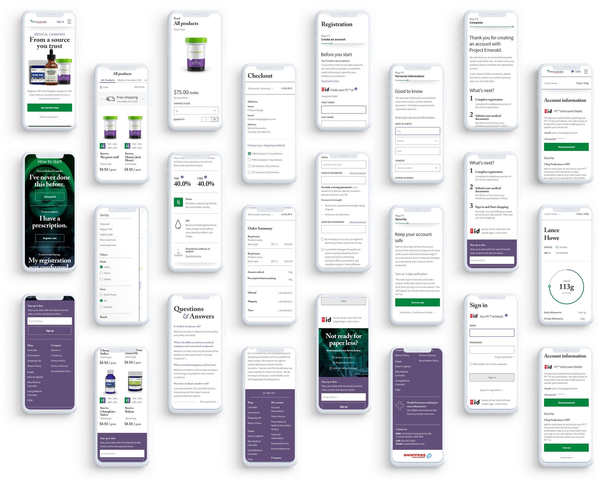
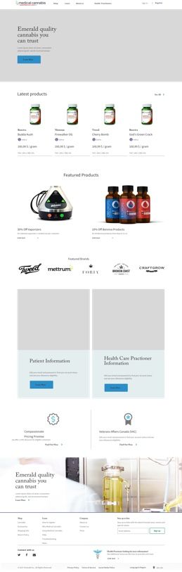
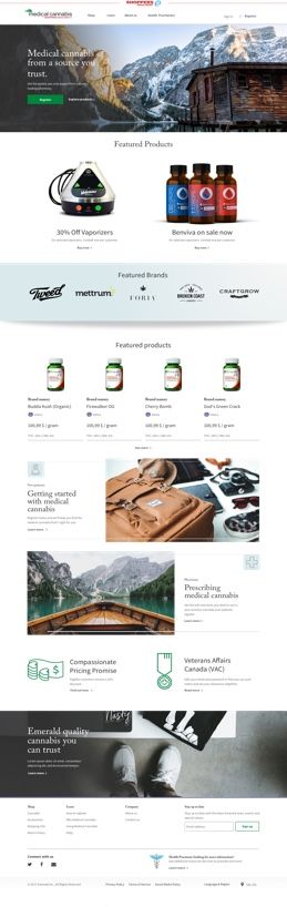
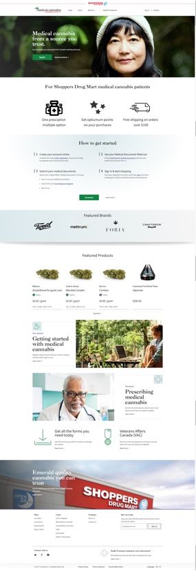
The final design
After the initial concept we brought on a fantastic product owner in Greg Samba (linked in). He keep the ship a float and was heavily involved in making sure out customer feedback was heard with our stakeholders and that our developer partners had what they needed.
We got some amazing feedback from the qualitative feedback we gathered from our tests and interviews. We made sure to update the site accordingly. This UI update was done it’s own 2 week sprint after all our testing and iteration we completed.
Watch the video to see the full site experience
Feedback & insights
75% of customers gave feedback on the UI, stating the site looked cheap and sterile, therefore not something they would expect to encounter from shoppers.
80% of the customers had some difficulty understanding how to start their journey, and tended to scroll right past the module on the homepage. The main We adopted a gated a approached and helped customers self identify.
Registration also had a lot of questions, on how to do it and what was expected. We worked on chunking out the information and present the relevant information at the right time.
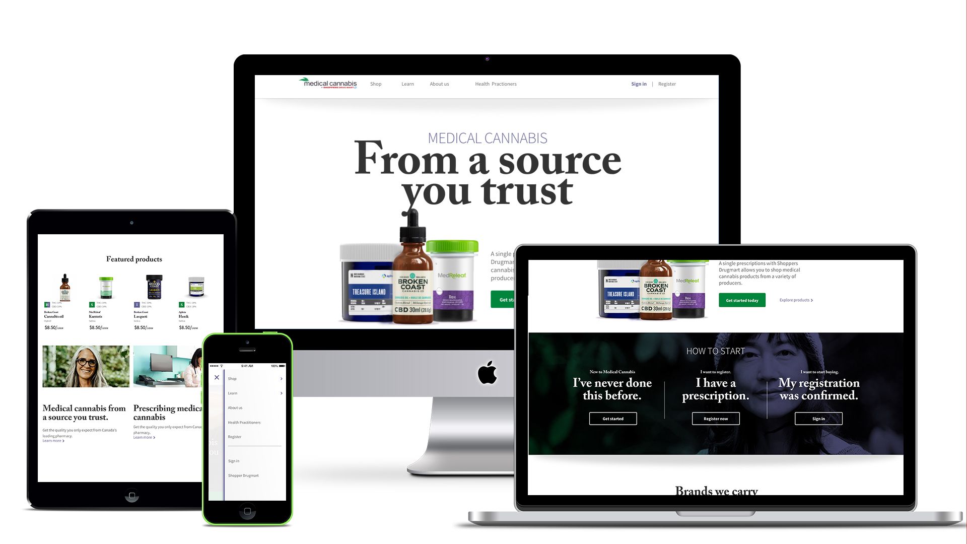
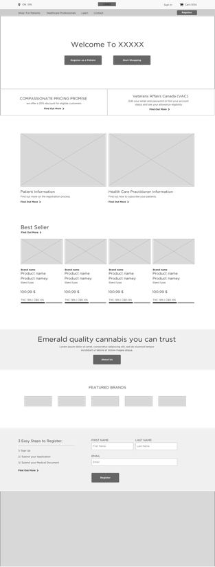
Early homepage designs
TL;DR
Lead the design output for the project, and started the project planning. Worked with 2 other designers that roatated in and out. Used storymapping to help distrbute the work to the other designers so we could finish the entriee site flow in 2.5 weeks, and have it tested and valided in 6. Keeping stakeholders involved every step of the way.
OTHER CASES
Have a look at some of these other projects