My role
lead the design process, strategy and implementation of the system. I was responsible for how it was going to be used on the following projects and the architecture of the Sketch file.
Since leaving the project it's been handed over to the very talented Joana Ferret who has since interated on the systems.
The problem
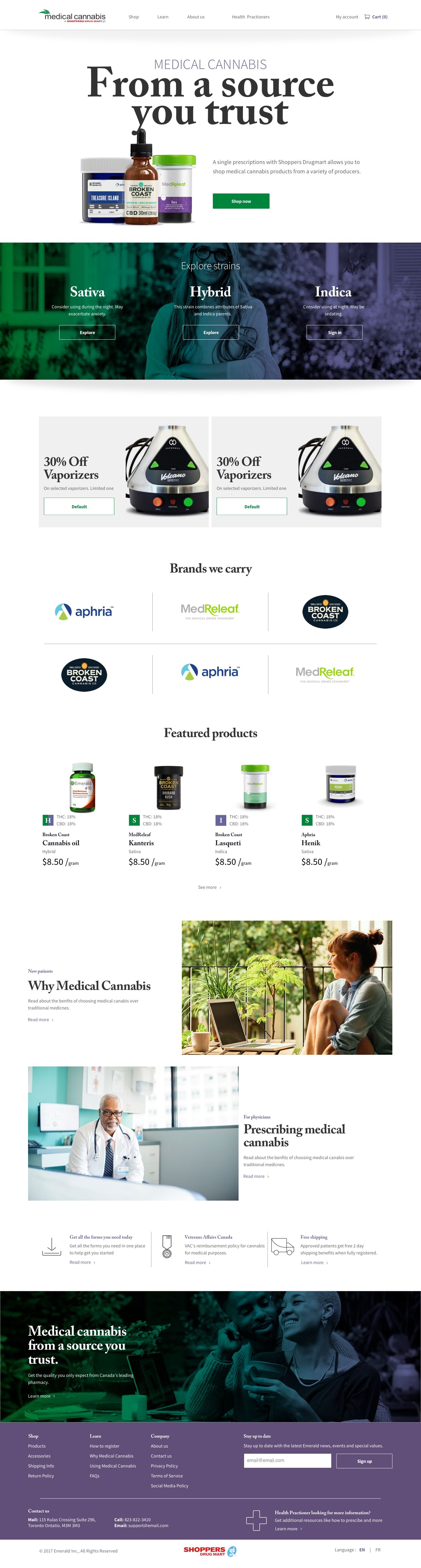
While working on the Medical Cannabis by Shoppers (more about it here), we needed a way for the designers to create components without any styling, but also enough to align with our developers to create pages when the designers we done.
Since everything need to be done quick and a bit dirty, we need to align on a language that allowed us to not be pixel perfect.
The Challenge
The vision, building for the future and make sure that the other brands eventually could use the system. We needed it to be accessible (from a WCAG standpoint) reusable and flexible enough to applied different stylings. We had a mantra of “Consistency is not conformity".
The system
What's in a name?
We named the system Potluck. The reason behind the name is simple. Since this system was going to for all the brands, and everyone is welcome to contrbute something, and it's about sharing, it really named it's self.
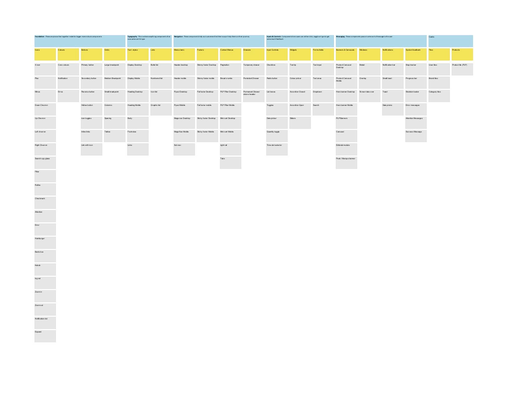
Laying the foundation
I began by understand the anatomy of more complex components (eg. Banners and buttons), and started to unpack them until we identified what were the singular foundation or base components.
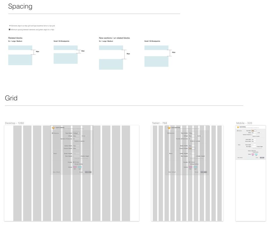
First setting rules on spacing, grids, typographic spacing and sizes, colours and icons. Once agreed we could move forward and not have to worry about the designs being handed over as pixel perfect.
Once all this foundation was set, the rest would fall into place.
The Grid
We used an 8pt grid and building the REM values, and setting the spacing for related and un related content in mobile and desktop touch-points.
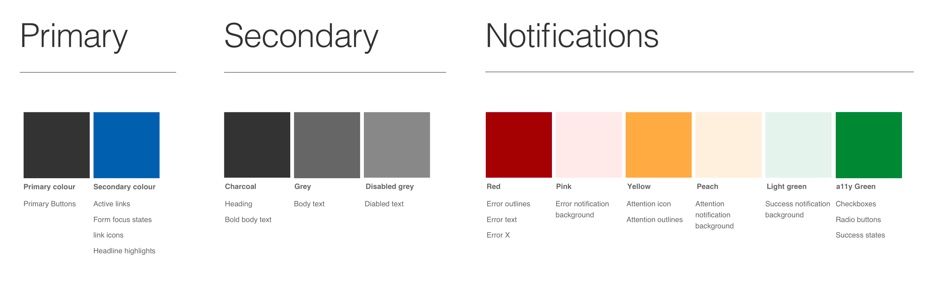
The colours
We split the colours into 3 Buckets:
Primary, used with typography, buttons, CTAs and states. Secondary, applied on accents and backgrounds, and Notification, Used to only when needing to bring attention to the user.
Typeface
Since this was going to be a headless System Helvetica was used. Allowing anyone starting up a project to use it.
Type sizes were then mapped to their respective heading sizes and classes. Display, Used in banners and only for display purposes. Headings, Following symantic html headings throught the site H1 throught H6. Body, this class did not scale and was set at a fixed height for all view ports. Containing body copy and legal text.

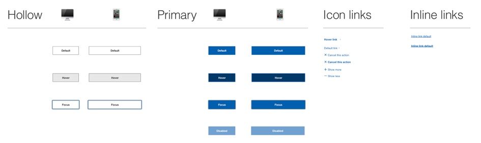
Buttons
The idea for buttons was that there would only be 1 per page for the customer had a clear understanding of what they need to do. If there were secondary CTAs a link with icon would be applied
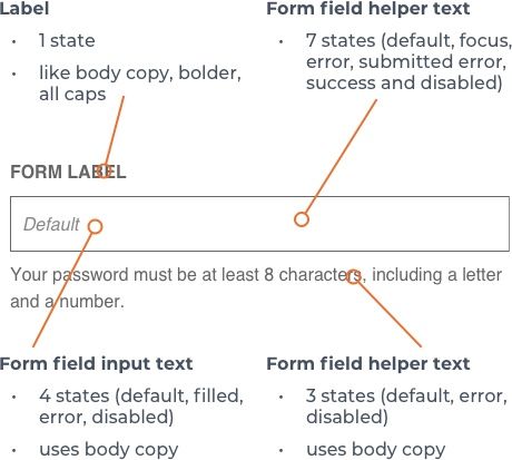
Forms elements

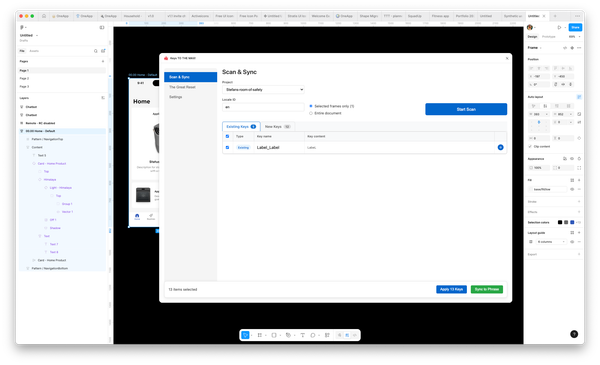
The Sketch file
We crafted a master sketch file connected to the story map. It was filled with cleverly nested components.
With the sketch file, we used Abstract for version control and a way to allow designer to link their working files to the library to seamlessly work with the system.
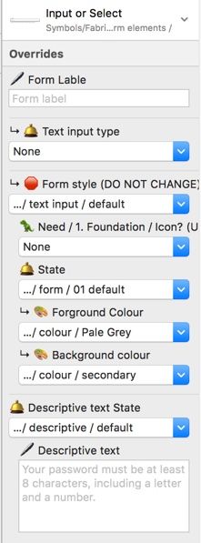
Adding a legend
Using emojis allowed designers quickly identify the proper overwrites. So they could tweak the components for their needs.
Need something ? 🦖
State 🛎️
Edit 🖊️
Icon selection 🌀
related ↳
swatch 🎨
do not change 🛑
start 🏁
Desktop 🖥️
Mobile 📱
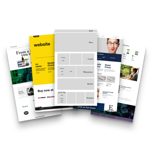
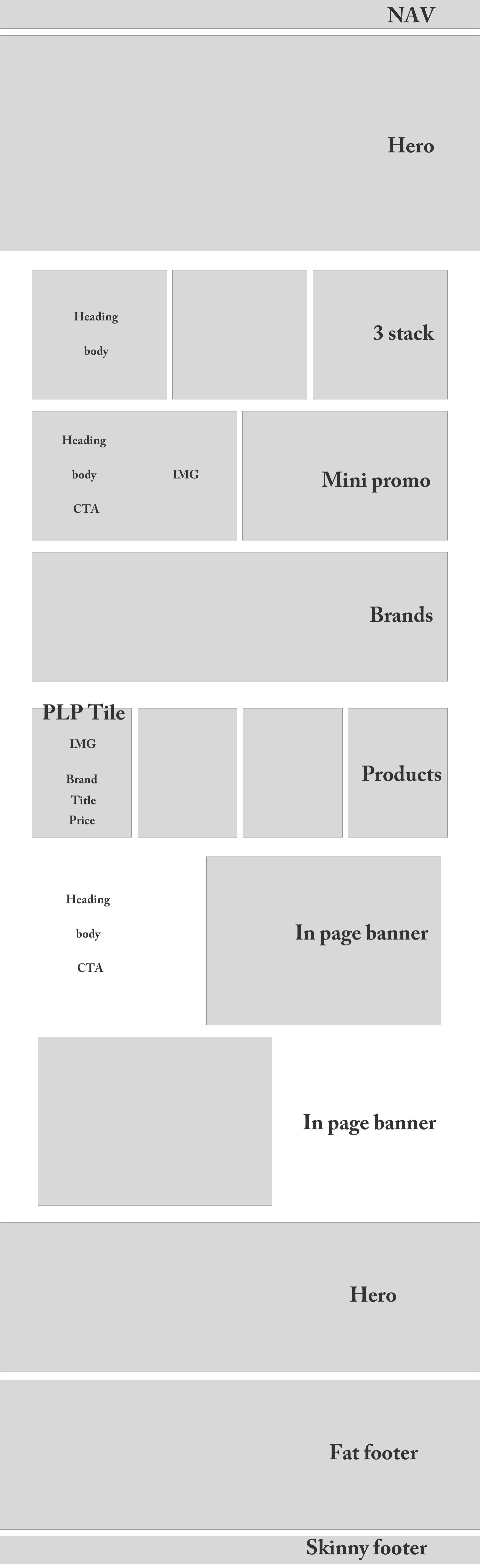
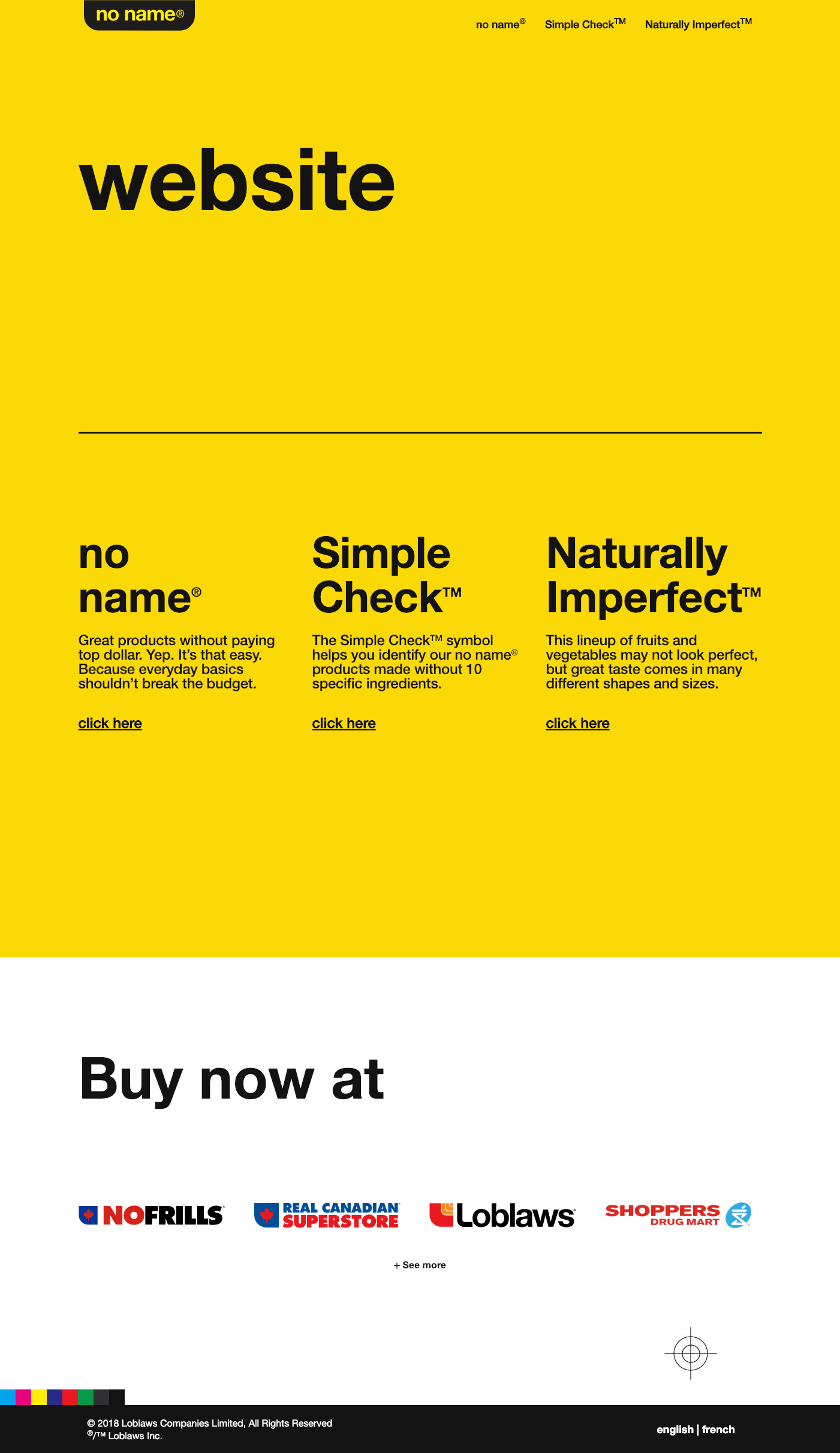
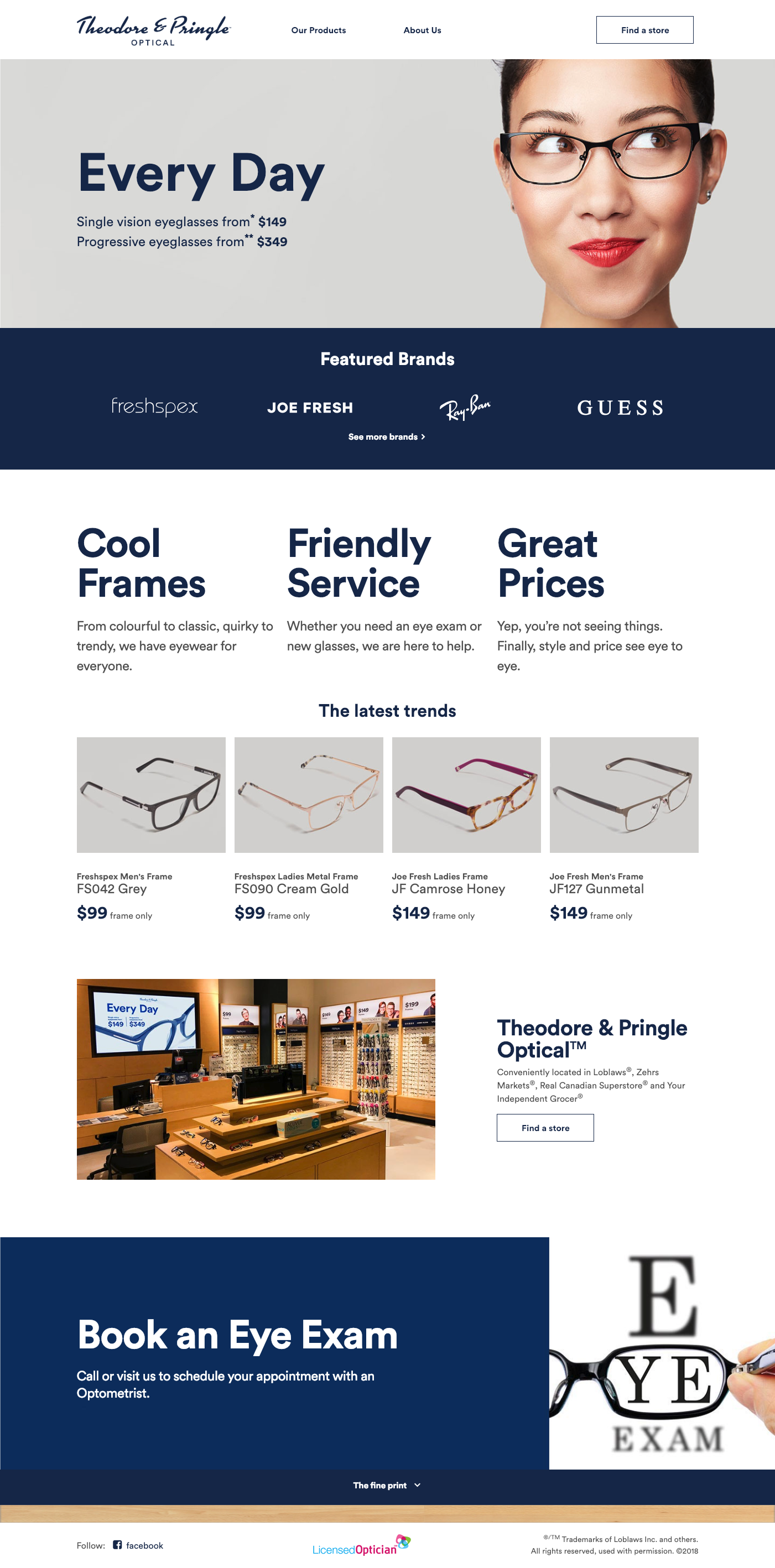
The System in action
Here is an example how the same base components, were used on 3 different sites.
Learnings
Collaboration is key
We worked to with our developer partners on this to make sure as new components we built and rules set aligned, having a clear understand of each others expectations.
Process in essential
For a project moving this quickly, it helps to break things down to find how it can all connect. Sometimes you need to go slow to truly go fast.
TL;DR
In order to move quickly I helped created a headless design system, for this project that would allow us to re use components and focus more on experience and less on pixels. This was then used on 2 more sites Noname.ca and Theodore and pringle.