NoName.ca
Designing for 1997 in 2017. The less you have on the site, the more people get your message.
My role
Led the design team to creating a seamless user experience journey for the brand. Facilitated the kickoff and UX workshops.
The problem
No Name was one of the most fun and challenging projects I had done to date.
We were asked to create a simple site (3 pages) to help support 2 initiatives. Their Simple Check and Naturally Imperfect campaigns. Being a brand created in the 80’s they still didn’t have a website of their own.
Note: When I say WE I mean myself (Stefan - Senior product designer) and Adam Brace (product designer) who I had the pleasure working with on this project.
The Challenge
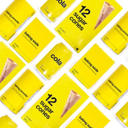
Simplistic and minimal design that is associated with their product. Mimicking their real world products on the web. Figuring out where we would drive users that enter this site.
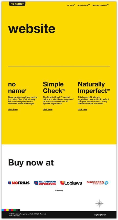
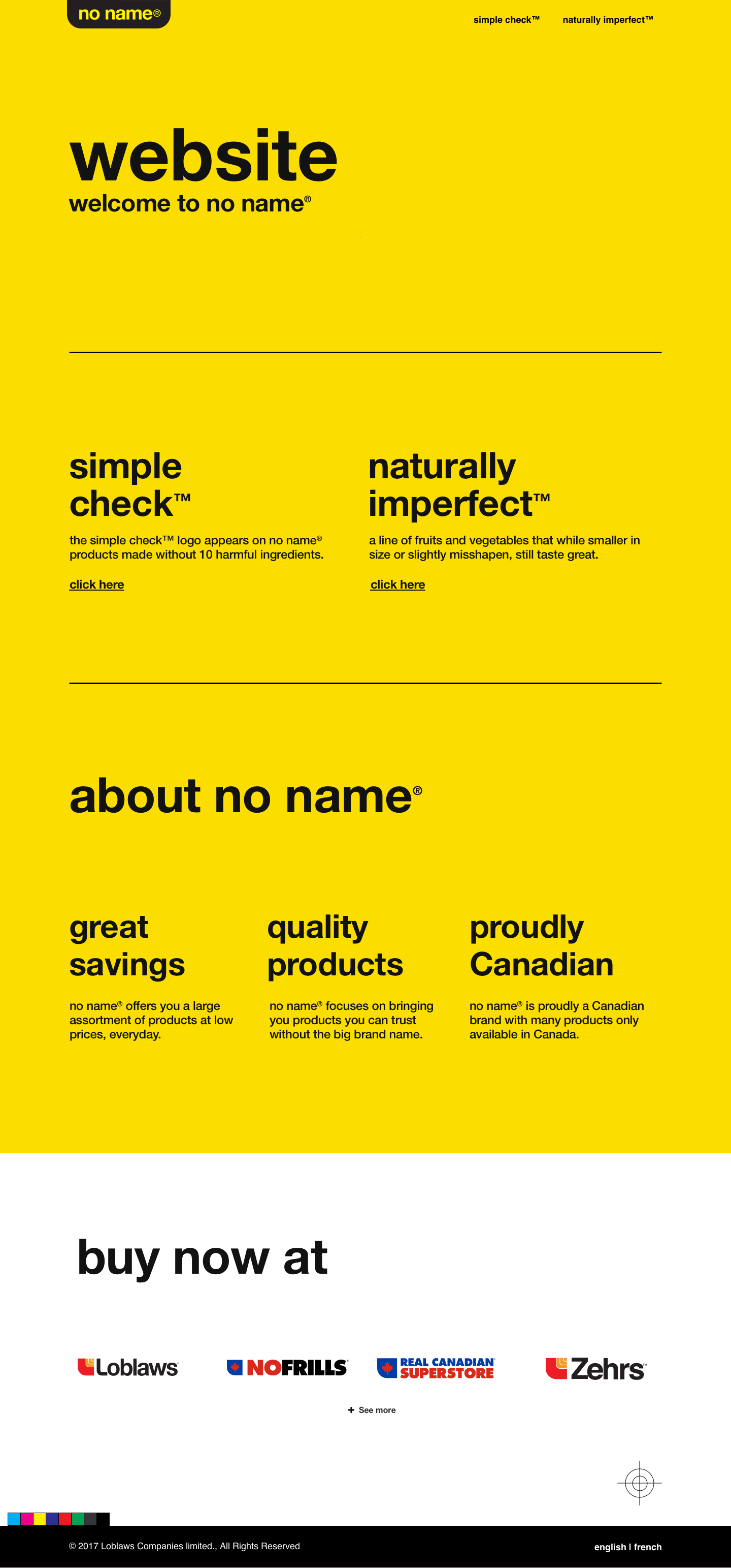
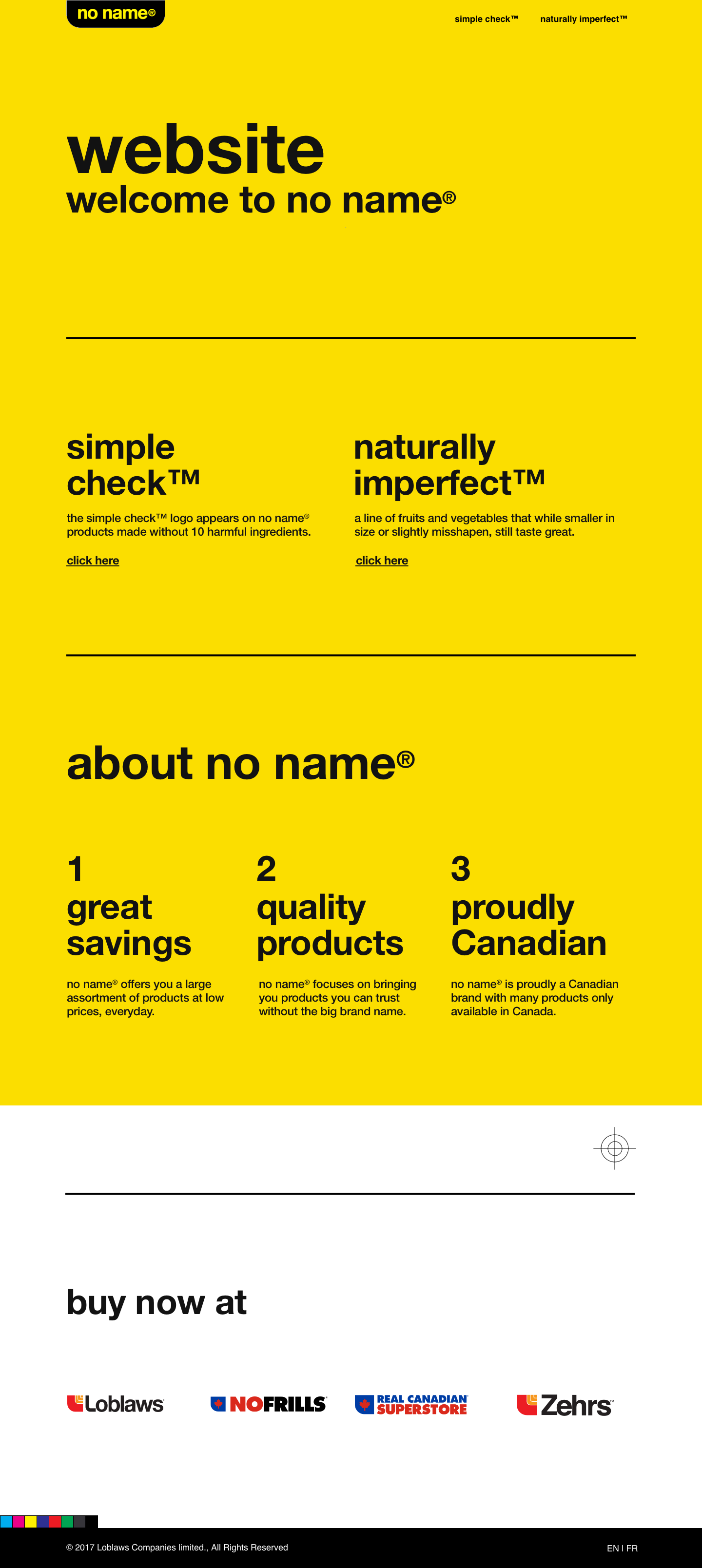
The final design
Kicking it off
To kick it off I ran my "patent pending" express design kickoff meeting. Which entails gathering requirements and sketching session to get the juices flowing. Also helping us understand what the client (in this case the brand team from the central office) is looking for.
Insights
First, we needed it to reflect the brand, support the new Simple Check initiative. Also, explain to people why they would want to buy No Name products and get rid of the cheap and cheerful stigma that control brand carries.
Shortly after we created the information architecture (it was only a 3 pages site... with 2 error pages but still good practice) and user flows. Outlining the next best action for the users and figuring out where we were going to funnel the traffic from this new site.
How we're measuring success for this site is to see how many people engage with the content, click through to partner site and but noname products vs before.
Process
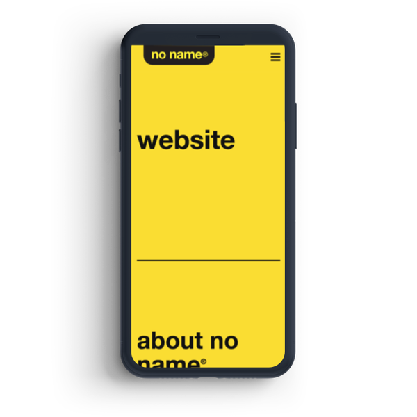
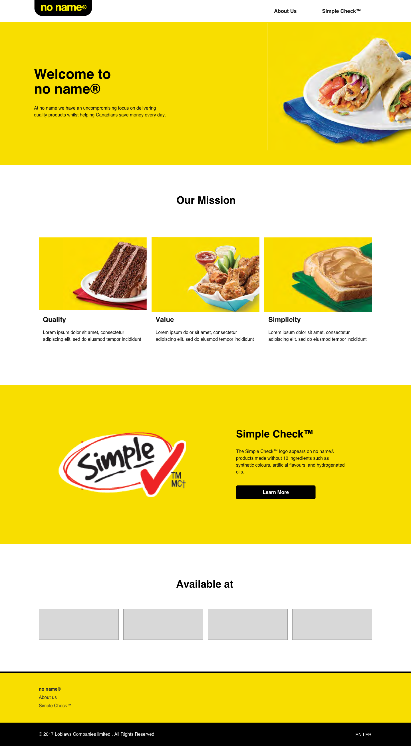
After setting a good foundation we applied visuals and this is where it gets interesting. Each round of visual design challenged what we knew. We would add photos, icons, and frills to the site. But it didn't feel like No Name. Until we got this the version you see today.
All of our instincts said this won't be good... yellow site black text virtually no images... no one is going to look at this site... no one is going to know where to go what to do or EVEN WANT TO READ IT.
After 5 rounds of moderated usability testing with grocery customers. The site performed well, with the absence of images, people scanned the text understood back text with an underline was a link. No problems consuming the information and understanding where to go next. Our assumptions of how it would perform were pleasantly disproven.
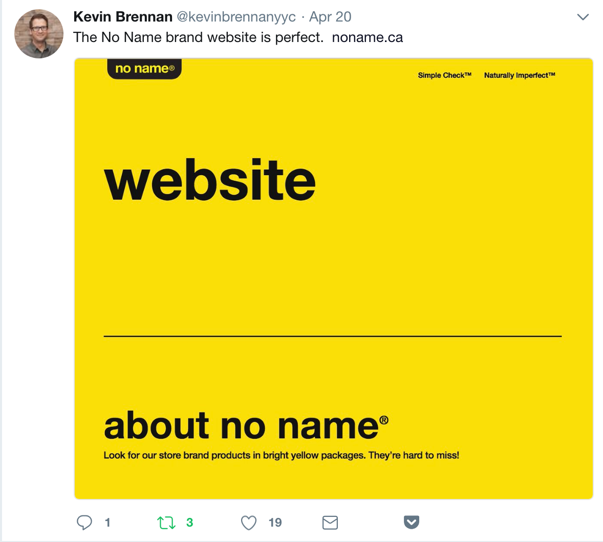
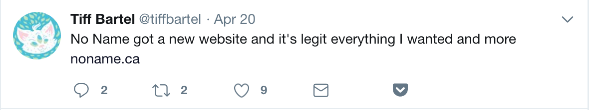
Twitter feedback

Learnings
Without images or icons, people will read more
With an established brand like noname people loved that it mimics their real-world understanding of what it was.
TL;DR
Senior designer, ran workshops, helped with wireframing and over saw the project with a small team. It ended up being a 4 page site. Challeneged current web design, by having limited images. The site suprisingly tested posivitly during usability sessions and was well recived on twitter.
OTHER CASES
Have a look at some of these other projects