Patient Journal Werlabs
Humanizing Healthcare: Revolutionizing the Patient Journal at Werlabs to make it easier to understand
Introduction
At Werlabs, the redesign of the patient journal presented an intriguing challenge. It required harmonizing inputs from four product teams, including medical doctors, operations, customer service, and marketing, alongside the technology and product teams. This multifaceted collaboration was essential for understanding and refining the entire service flow of the patient experience.

Objective
The core issue we aimed to address was the users' difficulty in comprehending their blood test results. The existing patient journal was not user-friendly—recipients of the test results often lacked clarity on their health implications and the proactive steps they could take for prevention. Our goal was to demystify these results, making them accessible and actionable for the average person.
Process
Research and Evaluation
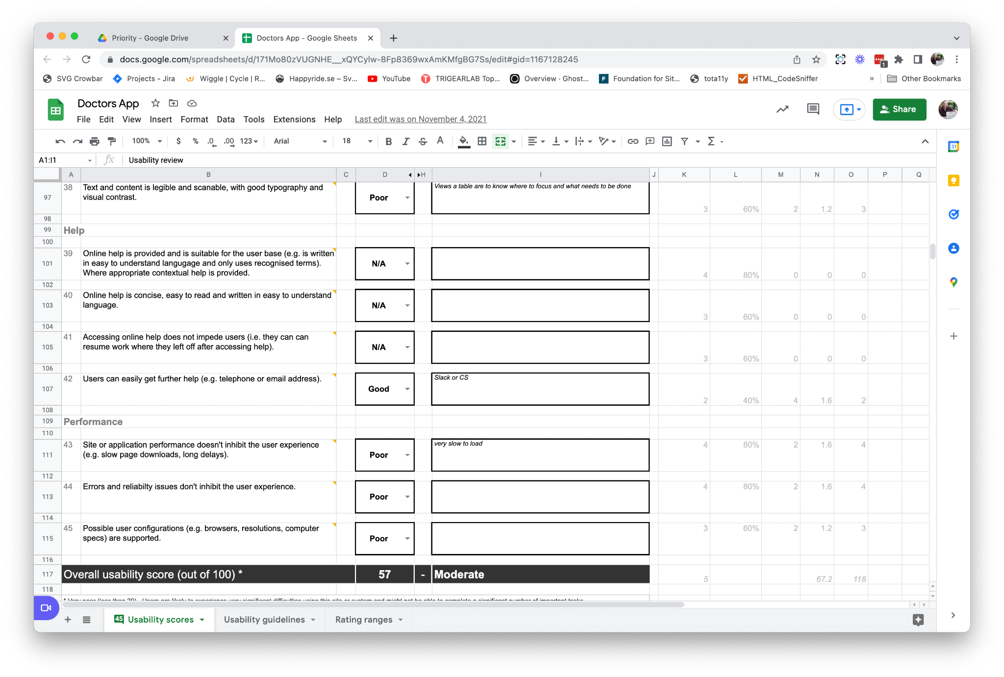
The project kicked off with a heuristic evaluation to score the site and audit the current screens. Baseline usability tests were conducted with users to identify pain points and opportunities for improvement, scrutinising the end-to-end user journey, from ordering a test to receiving results.
User Flow and Competitive Analysis
Developing user flows was crucial to understanding the stages at which users received information and how it could empower them. A competitive analysis, encompassing both direct and indirect competitors—including fitness and wellness apps, and even veterinary blood test results—provided a broader perspective on user information handling.

Information Architecture
Armed with this knowledge, we constructed the information architecture, delineating site maps and content flows that would most effectively present this information. Iterative design then became our mantra as we began refining the presentation of the pages.

Information Sorting
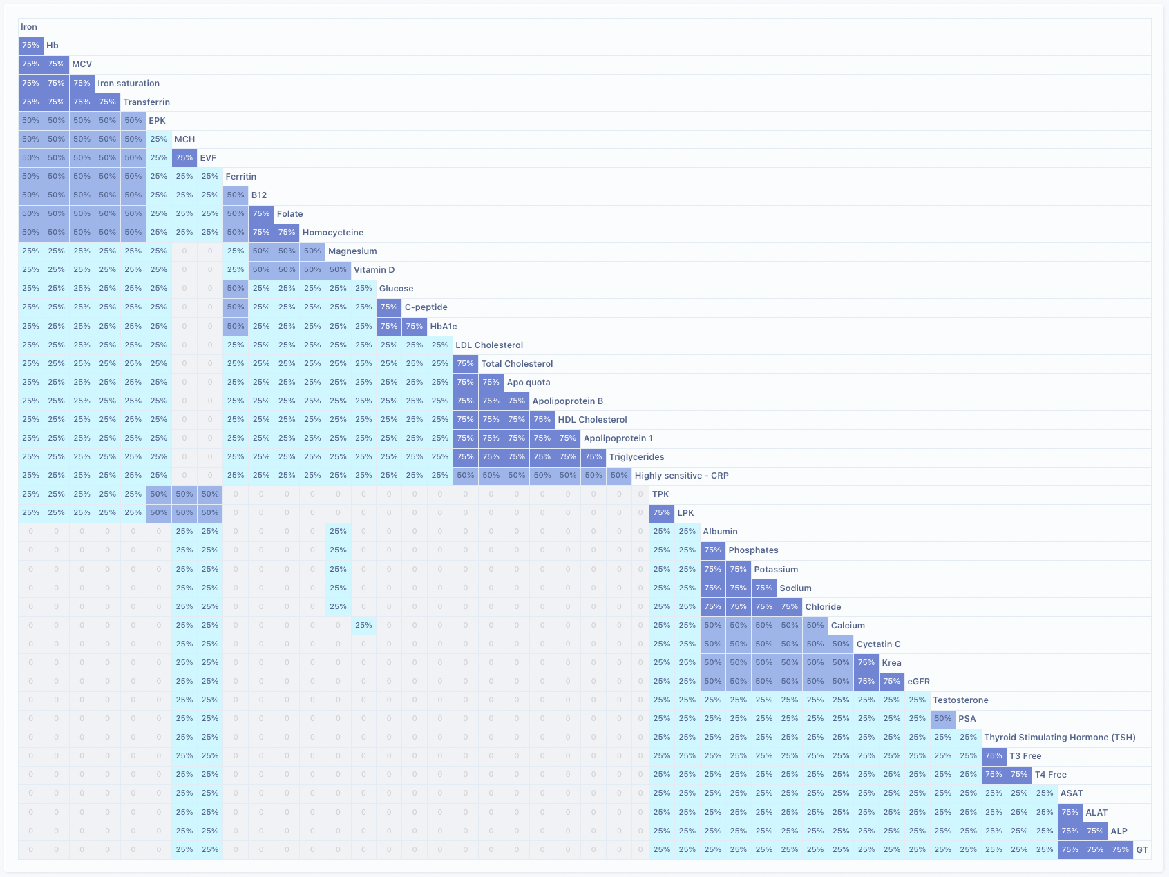
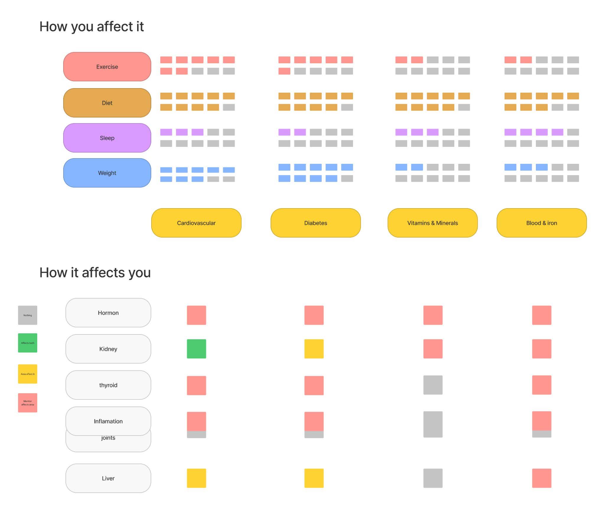
A key challenge was the organization of information based on blood test markers. Through multiple card sorting sessions with both users and doctors, we gained insights into intuitive categorization, leading to two distinct data sets:
- Values You Can Affect: Guidance on how users could impact their health markers through lifestyle changes.
- Values Affecting You: Critical markers indicating the need for medical intervention.
Design Iteration and Usability Testing
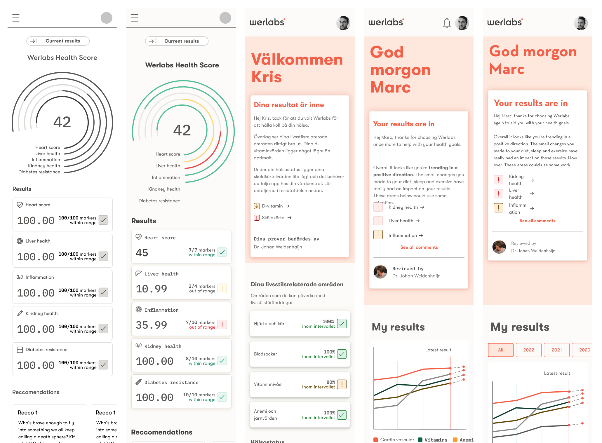
Initially, users were bombarded with an overload of information and visual clutter. Through successive rounds of usability testing, we honed in on a design that presented data concisely and coherently. We learned that providing bite-sized pieces of information tailored to the context of each page was far more effective than one overwhelming dump of data.

Final Design
Through rigorous testing and iteration, we crafted a patient journal that empowers users with understandable and actionable health insights. We took complex medical data and transformed it into a tool for proactive health management, delivering it in digestible increments to facilitate better health outcomes.
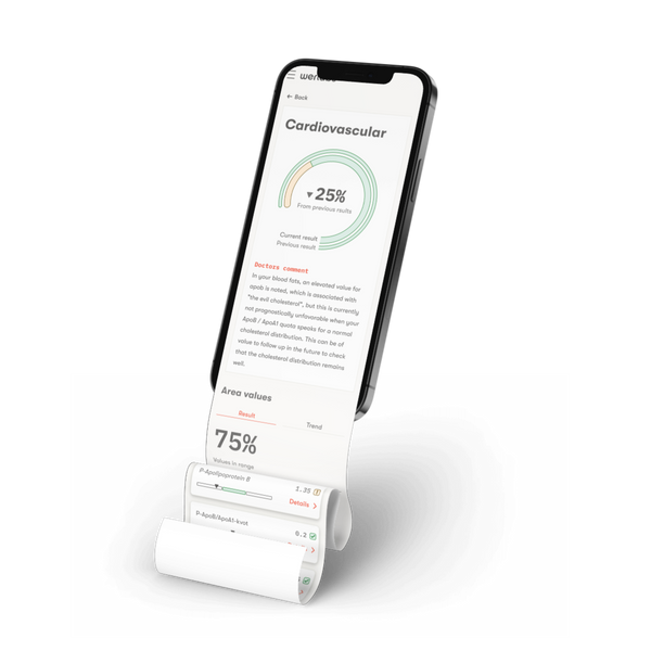
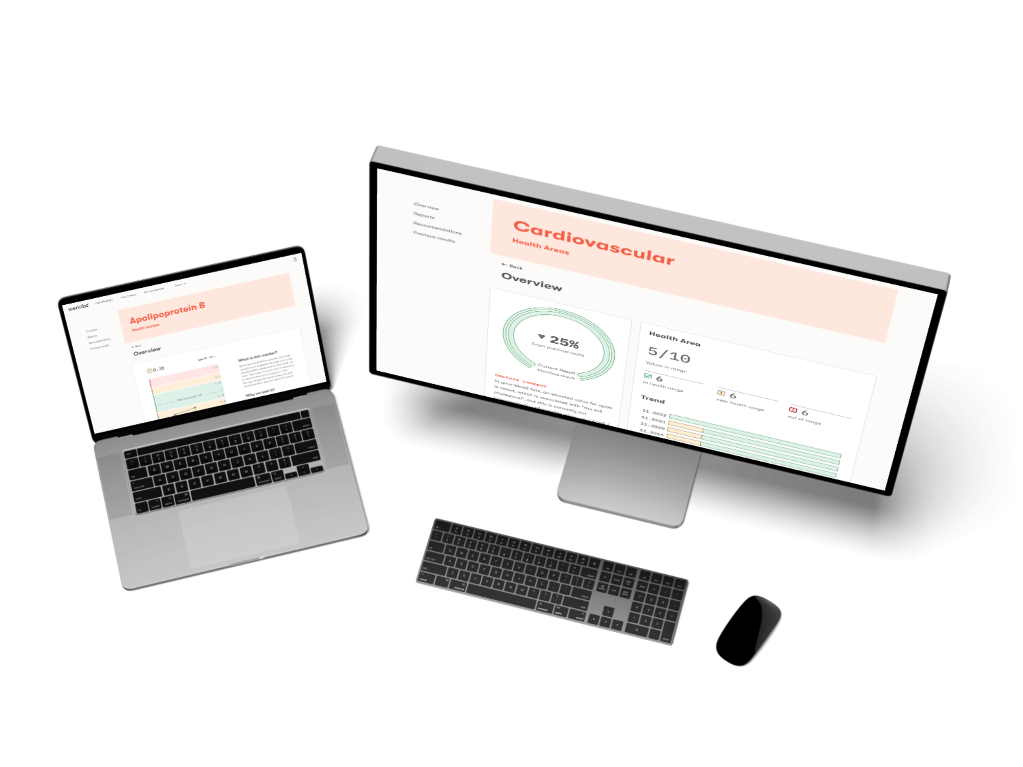
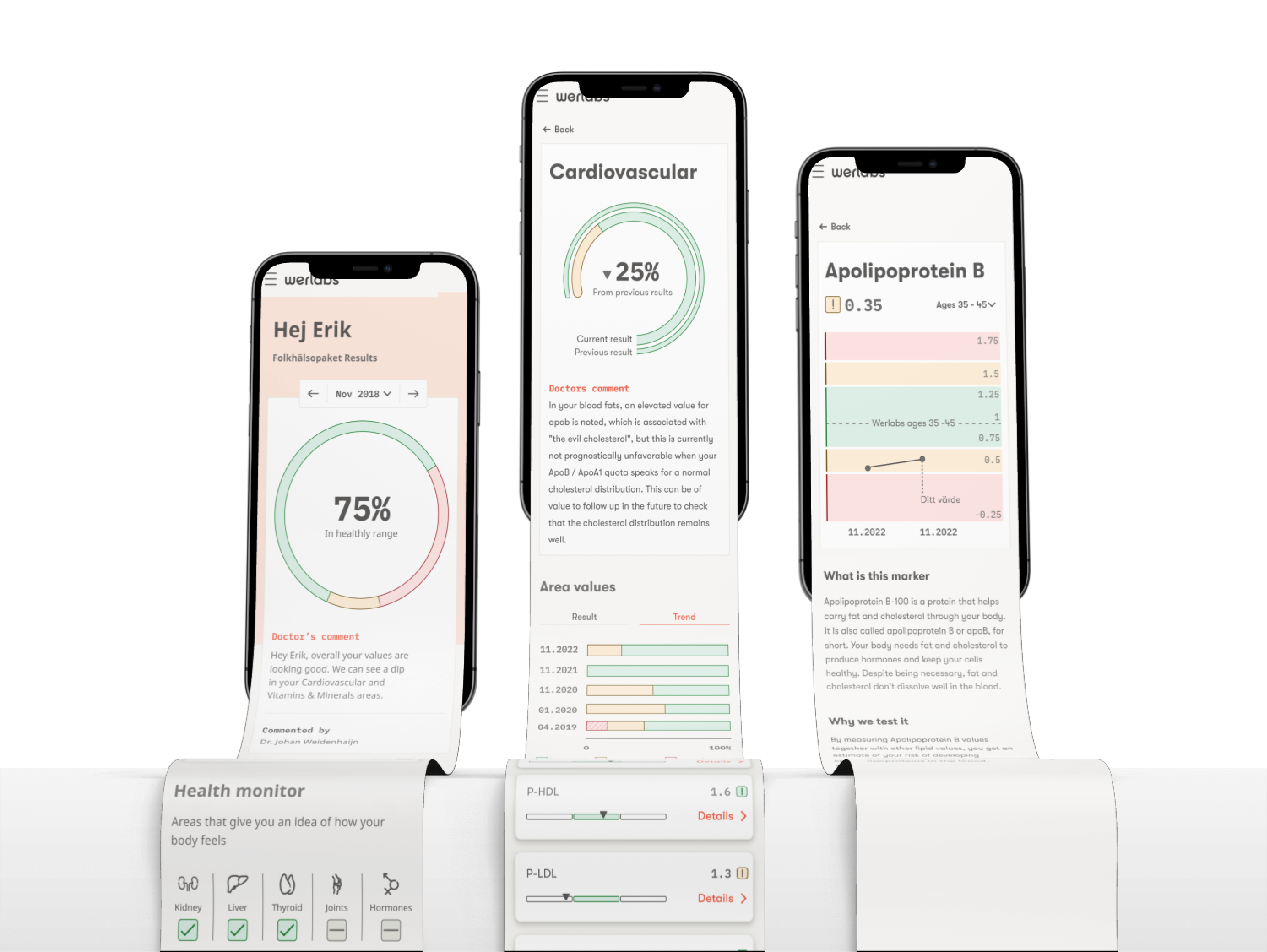
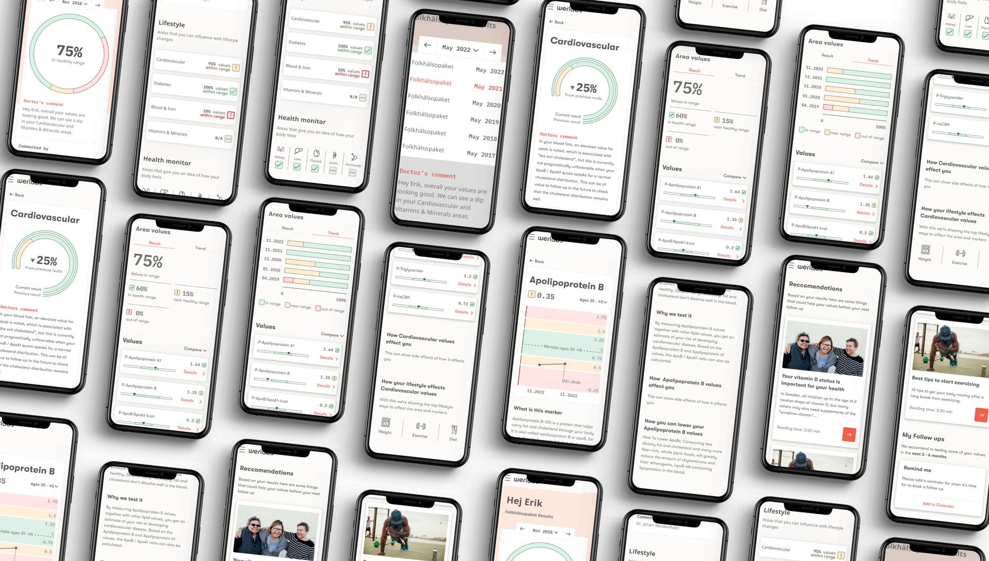
Our final design showcased a user's health markers clearly, indicating which were within a healthy range and which warranted attention. We introduced a trend feature, offering users insights into how their markers have changed over time. The design ensured compliance with accessibility standards and focused on emphasizing information through clear visualization.
Lessons Learned
The project at Werlabs underscored the importance of user-centered design in healthcare technology. It reinforced the value of iterative design backed by robust user research and the power of clear, accessible information in the hands of patients.
TL;DR
As the UX lead at Werlabs, I spearheaded the patient journal redesign, tackling the complex challenge of making blood test results comprehensible and actionable for users. Through a collaborative process, iterative design, and thorough usability testing, we delivered a solution that not only informs but empowers users for better health management.
